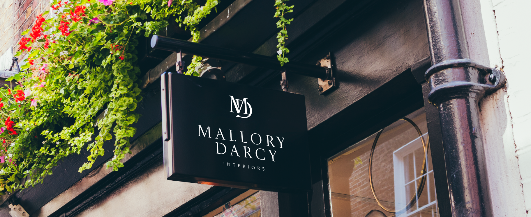
The main goal of this logo design was to create a unique and authentic representation of Mallory Darcy Interiors, a Nashville-based interior design studio. Mallory wanted a logo that would reflect the feeling of home — elegant, warm, and livable — while capturing the essence of her brand: transforming spaces into cozy havens that inspire intentional living. The mood we aimed for was one of quiet sophistication, aligning with her approach of bringing style to functionality and comfort to neutral, elevated spaces.
Mallory requested a modern and clean logo, with a soft, muted color palette to keep the look understated and elegant rather than stark or corporate. One of the biggest challenges was translating her personal brand into the mark while fulfilling her request to combine the first letters of her name into an interlocking monogram — balancing a personal, handcrafted feel with the simplicity and restraint the design needed.
The logo stands out for its clean simplicity, making it easy to carry across her website, social media, and print materials. Its distinctiveness comes from the interlocking "MD" monogram, paired with delicate, widely spaced type, that feels more like a refined, boutique mark than a typical interior design logo — sophisticated enough to signal expertise, warm enough to still feel like home. Since launching, Mallory has carried the new identity across her website and social presence, giving her brand a consistent, elevated look everywhere new clients find her.